

BILINGUAL BRAND IDENTITY · CASE STUDY
Eshaa
Precision, made visible.
A bilingual identity for a Saudi medical imaging engineering company. The symbol draws from radiation, isocenter geometry and the physics behind imaging systems, building a clear visual language for both Arabic and English.
THE CONTEXT
Eshaa is a Saudi medical imaging engineering company providing installation, maintenance, relocation and technical support for advanced medical imaging systems.
THE CHALLENGE
Translate the meaning of radiation and medical imaging into a distinctive bilingual identity without relying on generic healthcare clichés. The system needed to feel precise, premium and industrial, built for engineers, equipment, diagnostics and future manufacturing.

THE RESEARCH
Where the icon was born.
Before drawing the symbol, we researched the physics of medical imaging. Technical diagrams, engineering drawings and scientific documentation revealed how imaging equipment operates.
The isocenter, radiation beam patterns and gantry rotation axes became the structural foundation of the identity. The icon emerged from the physics of the field.





One system. Two languages.
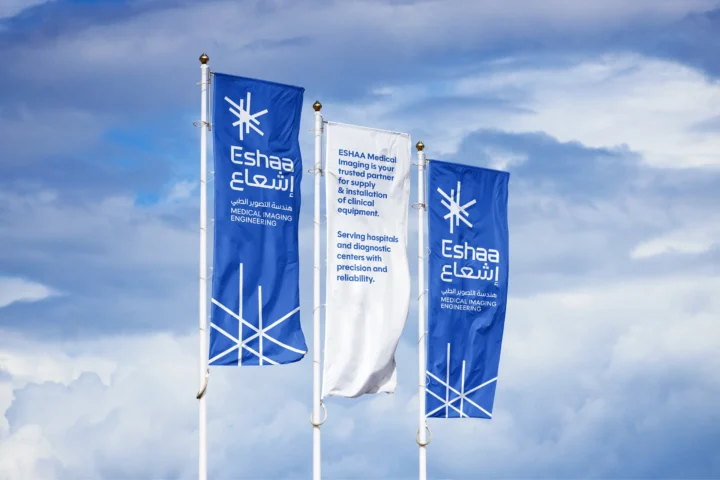
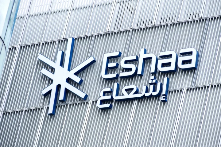
The Arabic and English versions carry equal clarity and confidence across MENA markets and international contexts, from signage and reports to digital communication.


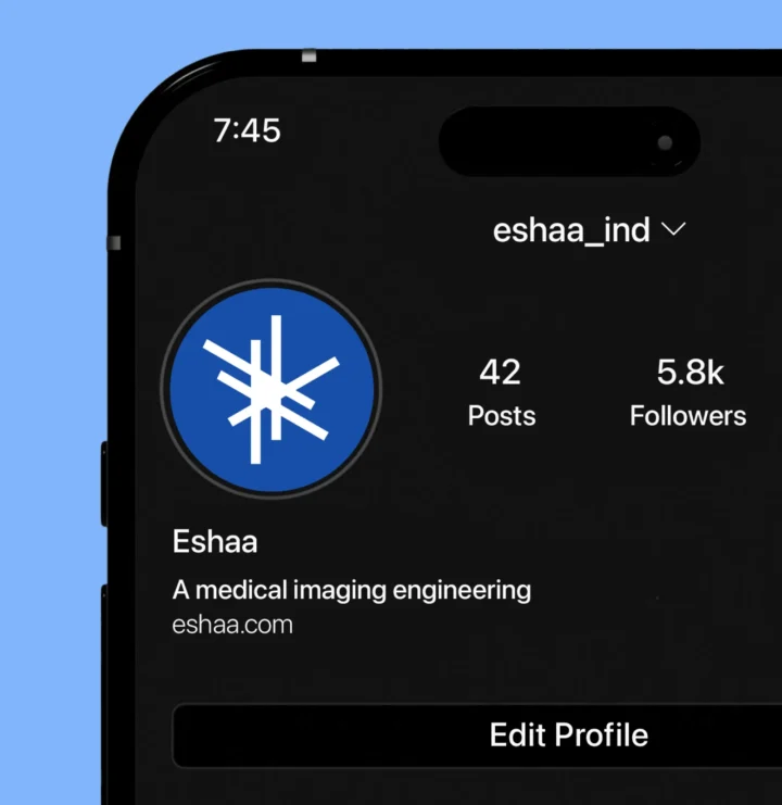
Engineered blues for precision and trust.
Eshaa’s primary blues establish precision, reliability and trust. A focused secondary palette adds flexibility across digital, print and environmental applications.


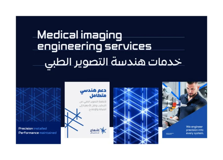
DIGITAL APPLICATION
Engineered for digital clarity.
Eshaa’s digital presence translates engineering precision into a calm, structured experience. Measured contrast and clear hierarchy guide attention, making complex information easier to navigate.
Every element works with purpose, creating an interface that feels technical, confident and unmistakably Eshaa.


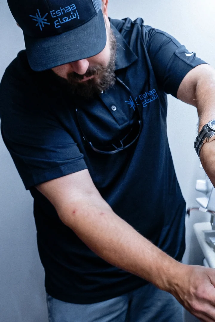
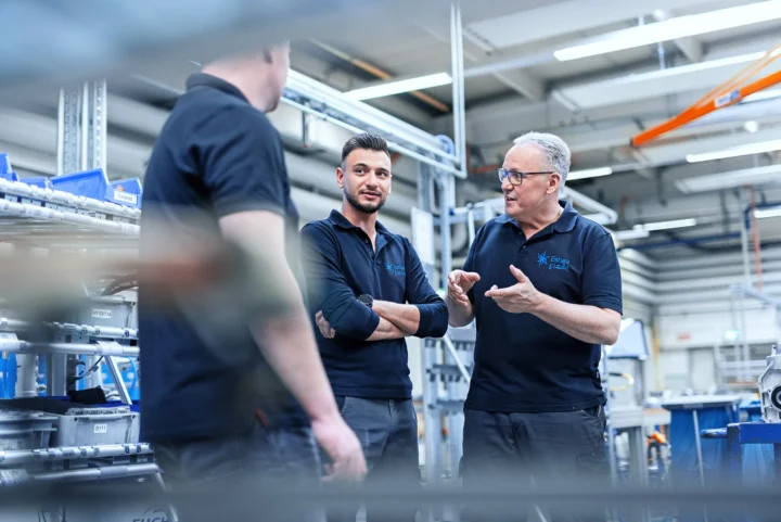
Engineering expertise that keeps medical imaging systems performing.




viewsappreciations
KEEP EXPLORING
More work to explore



YOUR NEXT CHAPTER
Let’s make your next move coherent
Tell us what’s changing.We’ll help define the right starting point.
Start a project →