An appetite for distinction.
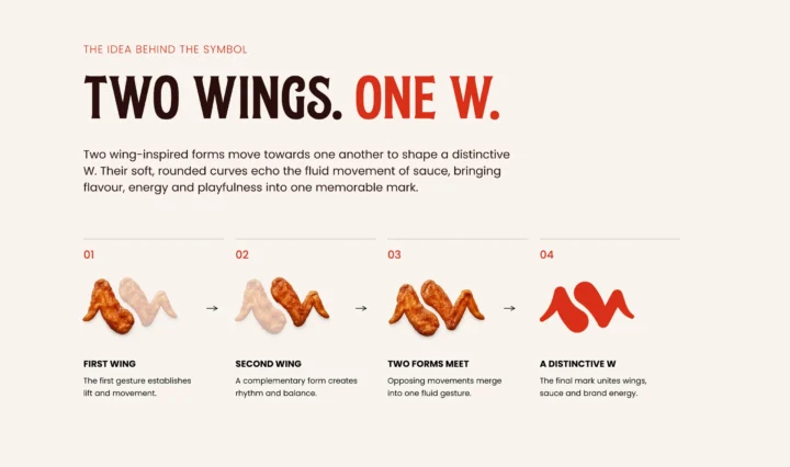
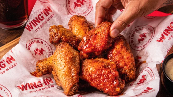
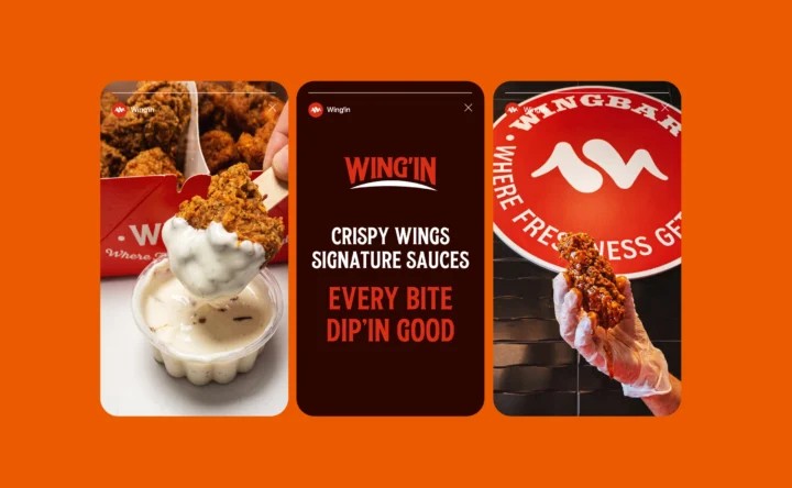
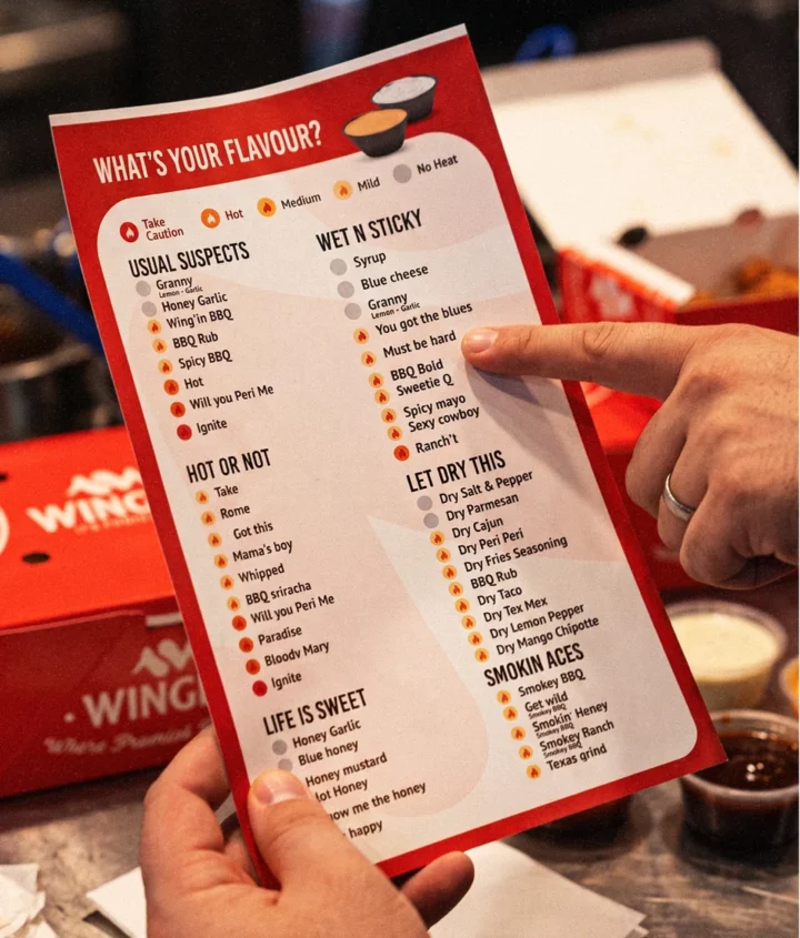
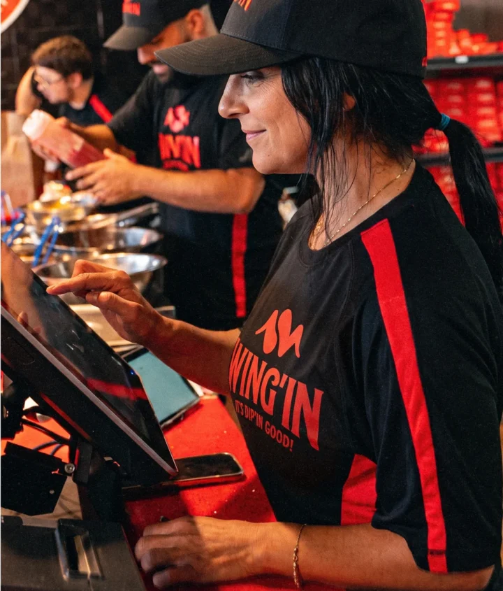
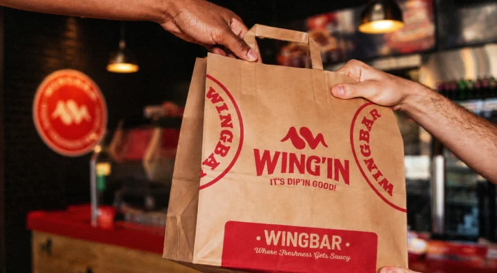
WING’IN is a fast-casual chicken restaurant built around one promise: bold wings, bigger flavour. Brandegree created a wing-shaped W, expressive typography and a warm, energetic palette, then carried the identity across takeaway packaging, menus, uniforms, signage, social media and motion.