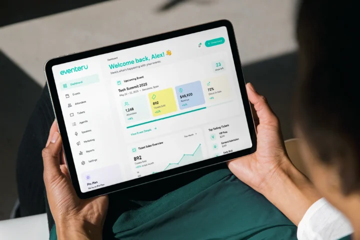
BRAND IDENTITY · EVENT PLATFORM
Eventeru
Events are moments. Eventeru makes them last.
A connected identity for an event platform that brings people, ideas and opportunities together.
THE CHALLENGE
Professional event platforms often force users to choose between usability and credibility.
Some feel crowded with features. Others feel too casual or overly corporate. While each solves part of the problem, few create an experience that feels both professional and approachable.
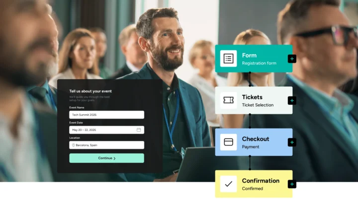
Eventeru needed a visual identity that could inspire confidence, simplify complexity, and support every stage of the event journey.
THE BRAND IDEA
A platform that connects people, ideas and opportunities.

THE CONSTRUCTION
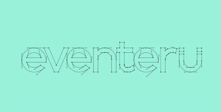
Every element of the mark is mathematically intentional.
The dual rectangular forms at the top carry the magnet pole concept. The arc beneath follows a precise radius.

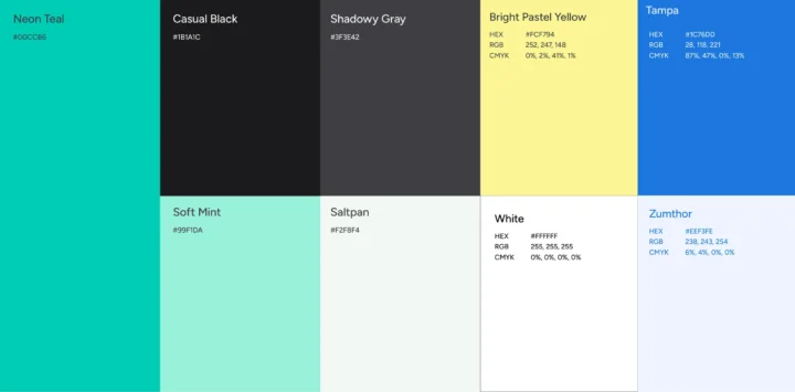
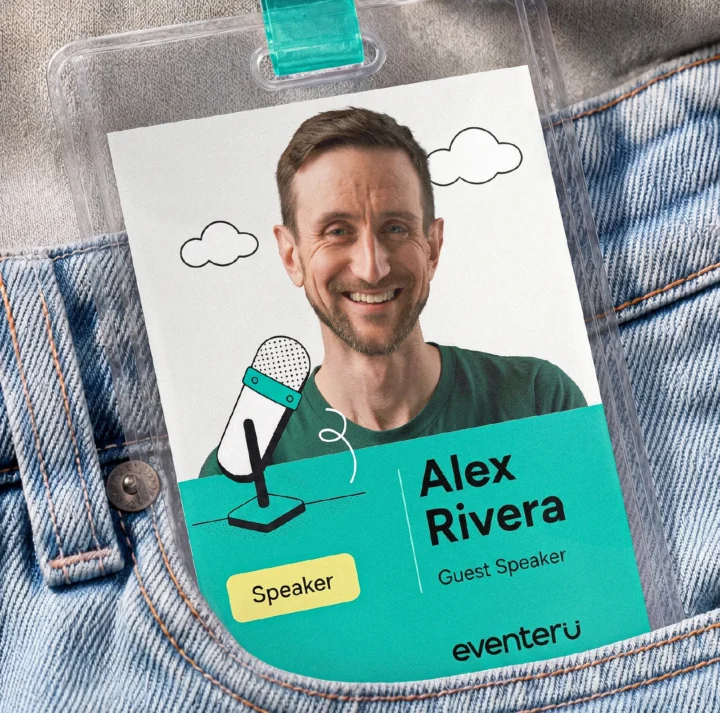
Teal is not an aesthetic choice. It is a functional decision. It signals clarity, modern structure, and the human energy of a well-run event. Black grounds it. Yellow interrupts it — once, where action is needed. Everything else stays quiet.


viewsappreciations
KEEP EXPLORING
More work to explore
YOUR NEXT CHAPTER
Let’s make your next move coherent
Tell us what’s changing.We’ll help define the right starting point.
Start a project →