
BRAND IDENTITY · DIGITAL · MOTION
Nindohost
- Country
- Morocco
- Sector
- Web hosting & domain names
From identity to everyday presence
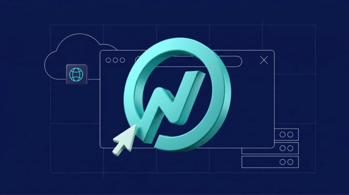
Nindohost is a Moroccan web hosting and domain provider. We refreshed its visual identity while preserving its recognisable turquoise, introducing a distinctive N monogram, a redesigned wordmark and a shared language of colour, typography and illustration.
What began with the identity and brand guidelines grew into an ongoing collaboration across print, landing pages, social content, advertising creatives and motion design. This case study brings together the identity and its application across the brand’s communications.
The evolution

A shared sense of direction
The founder chose the name in reference to Naruto and the idea of Nindō: following one’s own path. This story and the emblem of Konoha informed our exploration of belonging—a community of entrepreneurs united by a shared ambition. The resulting monogram brings together an N, a check mark and a sense of forward movement.
One identity, across everyday touchpoints
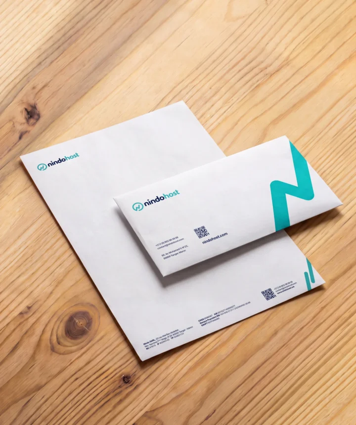
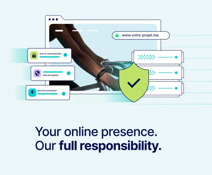
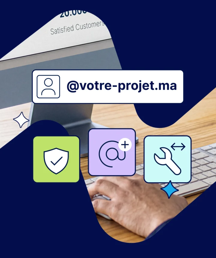
From stationery and service illustrations to landing pages and campaigns, recurring shapes, colours and graphic details keep the identity consistent. Real team photography brings a human presence to technical subjects.





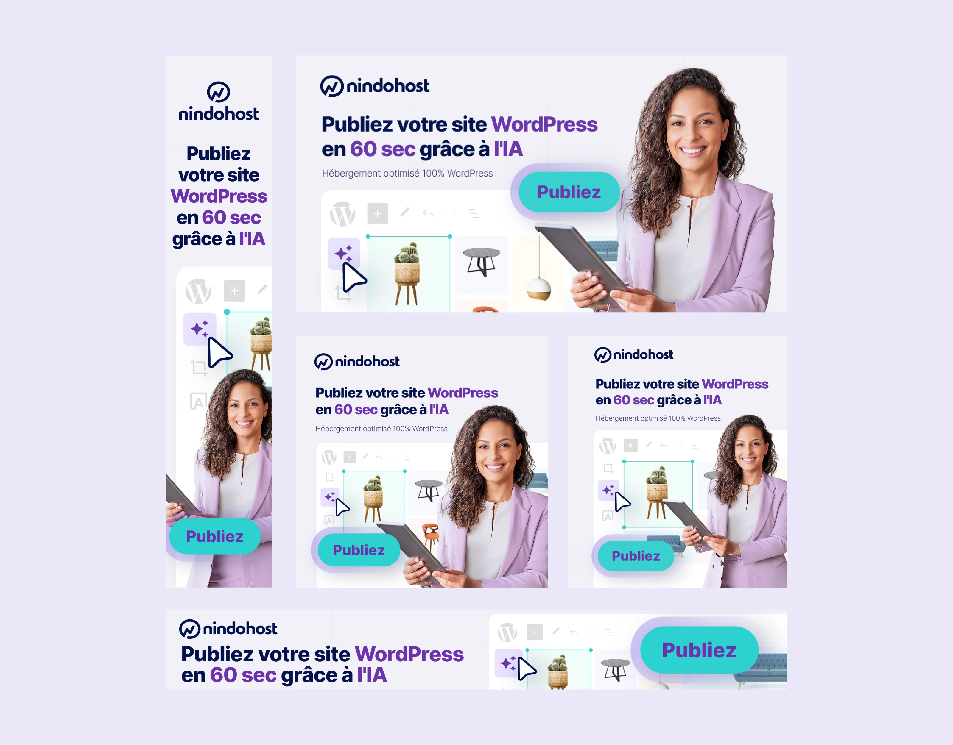
One campaign Multiple formats
Each layout is recomposed to preserve the message, brand recognition and a clear call to action—from wide banners to vertical placements.

viewsappreciations
KEEP EXPLORING
More work to explore



YOUR NEXT CHAPTER
Let’s make your next move coherent
Tell us what’s changing.We’ll help define the right starting point.
Start a project →