

A packaging range needs to support two readings: recognise the brand, then identify the right product. Design organises these tasks through a shared hierarchy and differences that are easy to understand.
The challenge often appears as the range grows. A layout designed for one product suddenly needs to accommodate several names, sizes or variants. Planning for that diversity early helps avoid rebuilding the label with every launch.
Map the range before designing the packs
List the products, their families and the criteria that distinguish them. Are the differences about fragrance, size, use, product tier or several of these together? The answers create a structure for the design.
Then establish the reading order. A brand name, product family and variant should not all demand equal attention. The priority depends on what someone needs to identify at the moment of choice.
Decide what remains consistent
The constants might include the position of the name, the typographic approach, a graphic shape or the information structure. They establish a visible relationship between products even when colours or imagery change.
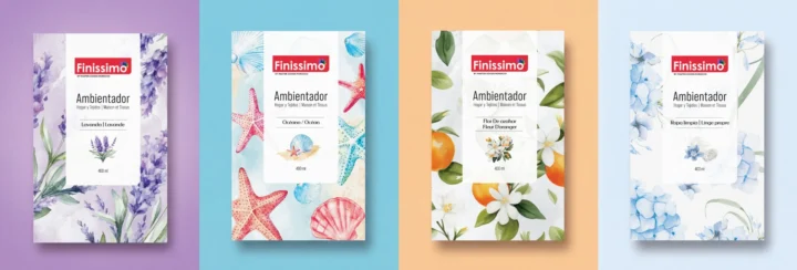
In the Finissimo project, the range is expressed through its label system. The useful focus here is the application: how individual references belong to a coherent family.
Give each difference a clear purpose
Colour can help distinguish a variant, but it should not carry all the information. A clearly written name, illustration or another readable cue can support the distinction. The range then remains understandable in different viewing conditions.
Avoid adding a visual code for every detail. If one colour identifies a family and another identifies a fragrance, document how they work together. Without a clear rule, exceptions can make the range difficult to read and maintain.
Design with real content
Test the longest name, narrowest label and most information-heavy product. Work with the dimensions and constraints of the actual container. A generous presentation mockup can hide a problem that appears at the real size.
Required and technical information should be supplied and approved by the people responsible for it. Design organises that content; it does not replace its verification. Reserve the necessary space before the composition is finalised.
View the products together and individually
A range needs to work side by side. Each product must also make sense on an e-commerce page, in a post or in someone’s hands. Check both conditions.
A small product photograph can reveal confusion that is easy to miss on a large presentation board. At close range, the label should let someone find the information they need. An attractive mockup is useful, but everyday viewing conditions remain the test.
Prepare for the next product
Document the constants, the variables and the process for adding a reference. Prepare production files and presentation exports, with clear names for each. A packaging mockup and a print-ready artwork file serve different purposes.
At Brandegree, packaging brings together identity, information and use. A well-structured range gives the team a basis for future work and customers useful cues for choosing. When those products appear in a commercial catalogue, the same decisions can help organise the information there.