Brandegree

BRAND IDENTITY · CIRCULAR ECONOMY

Nacmed

Brand identityLogo designPrint productionWeb design

Turning waste into resources

Nacmed helps Moroccan businesses collect, sort and recover materials responsibly. We built a clear identity around that purpose, then carried it through printed stationery, a catalogue in print and digital formats, and a website.

N-shaped clearing within a green forest, expressing Nacmed’s circular mission.

THE IDEA

A mark shaped by renewal

The N brings leaf forms and a blue central shape into one recognisable symbol. Green and deep blue connect the visual identity to the environment while keeping it credible across print and digital applications.

Construction of the Nacmed leaf-shaped N symbol.
Nacmed green and deep blue brand colour palette.
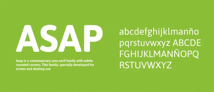
ASAP typeface and letterforms used across the Nacmed identity.
Printed Nacmed business cards on a grey surface.
Printed Nacmed letterhead, business cards and stationery.
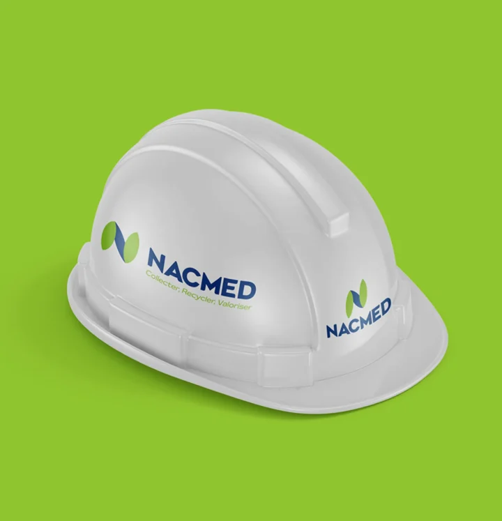
Nacmed identity applied to a white safety helmet.
Nacmed identity applied to a blue team T-shirt.
Open printed Nacmed waste-management catalogue, first view.
Open printed Nacmed catalogue with environmental service pages.

PRINT & DIGITAL

Explore the Nacmed catalogue

Designed for screen and produced in print, the catalogue explains Nacmed’s approach from collection and sorting to material recovery.

Nacmed catalogue cover, page 1 of 11

01 / 11

DIGITAL EXPERIENCE

The brand, built for the web

BRANDEGREE

Pass the project on

Choose a platform or copy the project link.

N-shaped clearing in a green forest for Nacmed

Nacmed

YOUR NEXT CHAPTER

Let’s make your next move coherent

Tell us what’s changing.We’ll help define the right starting point.

Start a project