A new logo can make a business feel ready for its next chapter. Then the everyday work begins: a sales presentation, a product launch, a mobile website, a second language. Different people make different decisions, often under pressure. Gradually, the brand starts to look like several businesses sharing the same symbol.
This is usually the moment when the limitations of a logo on its own become visible. The mark may be strong. What is missing is a shared way to use it, and to make everything around it belong together.
A brand system gives those decisions a direction. It carries an idea into the places where people actually meet the business.
Start with the idea the identity needs to carry.
Before choosing a typeface or developing a symbol, clarify what the business wants to be understood for. Who is it for? What does it do particularly well? What should someone recognise in its approach? The answers establish a direction that design can express.
The logo provides a recognisable signature. The visual identity gives that signature a wider language: type, colour, imagery, composition and graphic elements. The system explains how that language works across contexts, and how decisions should be made when a new context appears.
For a business built around clarity, that idea could shape direct writing, readable information and purposeful movement. A beautiful mark cannot carry those responsibilities alone. Every part of the experience has a role.
Keep the character. Give it room to move.
A product label, a recruitment post and a website answer different needs. Forcing all three into the same layout can make them less effective. A useful system identifies what should remain recognisable, then gives each application enough flexibility to do its job.
Imagine a food brand launching a second product range. The typography and information hierarchy might remain consistent while colour helps people distinguish flavours. Photography could follow the same art direction without repeating the same image. The connection is clear, but each product has a place.
This is the distinction between a system and a collection of templates. A template gives someone a starting layout. A system helps them judge whether a new layout still belongs to the brand. Both are useful; they serve different purposes.
Test the identity where it will actually live.
An identity presentation often shows the work at its most generous: large marks, carefully chosen images, plenty of space. Daily use introduces tighter constraints. A logo appears inside a small social avatar. A long product name needs to fit on a label. A presentation is edited by someone who does not have the original fonts.
Test these conditions while the identity is being developed. Include a narrow screen, a monochrome application, a crowded information layout and the most common document the team produces. Those tests reveal which decisions are robust and which need attention.
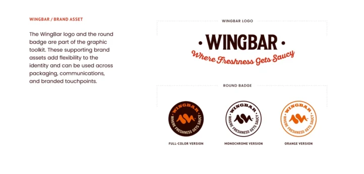
Responsive branding grows from this work. A compact mark, a horizontal signature and a full lockup each need a clear purpose. Their relationship should remain visible as the available space changes.
One identity, across two scripts.
For ESHAA, a medical imaging engineering company, the logo belongs to a bilingual identity built in Arabic and English. A geometric radiation symbol connects the different signatures, while horizontal and vertical lockups give the name room to work in different formats.
This is where the logo becomes a system. The symbol provides recognition; the relationships between the symbol, lettering, proportion and placement keep that recognition intact as the arrangement changes. An Arabic-led composition and an English-led one can each feel natural without becoming separate identities.
A bilingual sign, a compact digital space and a printed document cannot all use the same arrangement. Defining those relationships makes it possible to adapt the signature while preserving its character.
Let each language work on its own terms.
For a brand working across Arabic and Latin scripts, consistency needs careful judgement. The scripts have different structures, rhythms and proportions. Choosing two typefaces with the same nominal size will not necessarily give them the same visual presence.
Develop the relationship through weight, hierarchy, spacing and character. Test the actual names and messages the business uses, including longer translations. Establish how the languages sit together and when each leads. A bilingual lockup needs attention to balance, not simply an extra line beneath the original logo.
The same thinking extends to interfaces. Reading direction, alignment and navigation need to be considered in context. A recognisable brand can feel natural in each language when both are part of the design process from the beginning.
A system helps a team make the next decision with the same clarity as the first.
Give movement a role in the identity.
On screen, a brand has timing as well as appearance. The way a heading enters, a panel opens or a logo resolves contributes to its character. When every asset follows a different animation style, the identity can feel disconnected even if the colours are correct.
Motion principles establish a common behaviour. A precise, measured brand might use restrained transitions and a clear sequence of information. A more expressive brand may allow a wider range of rhythm and gesture. The choices should support the message and the task.
Begin with a small set of principles that can travel across the website, social content and film. Include a reduced-motion alternative and a strong static state. The identity should still communicate when movement is unavailable or unwanted.

Build for the people using it next.
A system becomes useful when a team can apply it with confidence. That requires clear files, practical examples and guidance that explains the decisions people make repeatedly. A long document has little value if the answer to a common question is difficult to find.
Show how to choose a logo version, structure a headline, combine colours and adapt a layout. Explain the reasoning where it will help someone make a new decision. Provide templates for regular work and keep the current assets in one accessible place.
Ownership matters too. Someone should maintain the files, review exceptions and update the guidance as the business changes. That small operational responsibility helps the system stay useful after the launch presentation is over.
Seven questions to ask of your brand system.
Before commissioning another individual asset, look at the material your team already uses. Put it side by side and ask:
- Is the central idea clear? Can the team explain what the identity is meant to express?
- Are the constants defined? Do people know which elements preserve recognition and which can adapt?
- Does it work at real sizes? Have the mark, typography and layouts been tested in everyday formats?
- Can the language change? Do longer translations and different scripts retain clarity and character?
- Does the movement belong? Do digital interactions and animated content share a considered behaviour?
- Can another person use it? Are the guidance, templates and current files easy to understand and find?
- Can it accommodate the next step? Could a new offer or channel fit without rebuilding the entire identity?
Keep the idea intact as the business grows.
Growth creates more decisions: more products, more people, more places to appear. A coherent system gives those decisions a shared foundation while leaving room for the business to develop.
At Brandegree, this is the work that connects strategy, identity, motion and digital. We define the idea, build the relationships around it and test them in use. The aim is a brand that remains recognisable, expressive and practical when the next brief arrives.