

An animated logo can give a digital experience a distinctive character. Used as a preloader, it accompanies a real wait before content becomes available. Its role should stay proportionate: a ready page should not hold someone back simply to finish an animation.
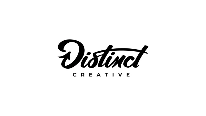
Brandegree created a logo animation for Distinct Creative Group, intended for use as a website preloader. The supplied sequence shows the mark building towards its final signature.
Find the movement within the mark
Logo animation begins with the construction of the identity: paths, rhythm, assembly, lettering and space. Movement can reveal a relationship already present in the design and make its character easier to feel.
In the Distinct sequence, the signature appears progressively against a light background. The final form remains the reference point. That continuity matters: the animation should resolve into a readable logo that also works when movement stops.
A geometric logo, a drawn signature and a compact symbol do not necessarily need the same behaviour. Start with the actual mark, then consider where people will see it.
Separate a logo film from an interface element
A logo animation at the end of a video occupies time deliberately assigned in the edit. An interface element shares the screen with someone who wants to read, navigate or begin a task. The expectations differ.
A portfolio version can show the full sequence. A website version may need a shorter adaptation, an early exit or a still state. The same file does not need to serve every context unchanged.
A preloader should correspond to a real wait
If content can appear immediately, a blocking introduction adds a step to the journey. It is often more useful to show the page and let the logo animate in a place that does not prevent navigation.
Where a wait exists, the preloader should clear when the page becomes usable, with a fallback if loading fails. Avoid showing a percentage that is not connected to measured progress. A waiting animation does not need to imply knowledge of a state it cannot measure.
A perspective from Nick Johnson
Nick Johnson, CEO and Brand Strategist at Distinct Creative Group, shared a video testimonial about working with Brandegree. It appears with the logo sequence to bring the creative result and a perspective on the collaboration together.
The client’s voice adds human context to the project beyond its presentation images.
Nick shares his perspective on working with Brandegree. His account appears beside the finished logo animation.
Design the states that do not move
The logo should remain identifiable in a screenshot, thumbnail or non-animated display. For people who prefer reduced motion, provide a still state or a very restrained transition. Also check what appears before the animation file is ready.
In an article or portfolio, a silent sequence can play on request. If it runs automatically and continuously, provide an accessible pause control. The presentation should invite attention without disrupting nearby reading.
Make the delivery decisions explicit
- The location and purpose of each version.
- The useful duration in each context and when playback should stop.
- Versions for light and dark backgrounds.
- A still state and reduced-motion behaviour.
- The integration format and tests on the intended devices.
At Brandegree, movement is a dimension of the identity. A useful animated logo belongs to the mark and to the experience in which it appears. Our article on the brand system explores the wider foundation for that relationship.